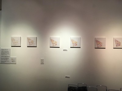
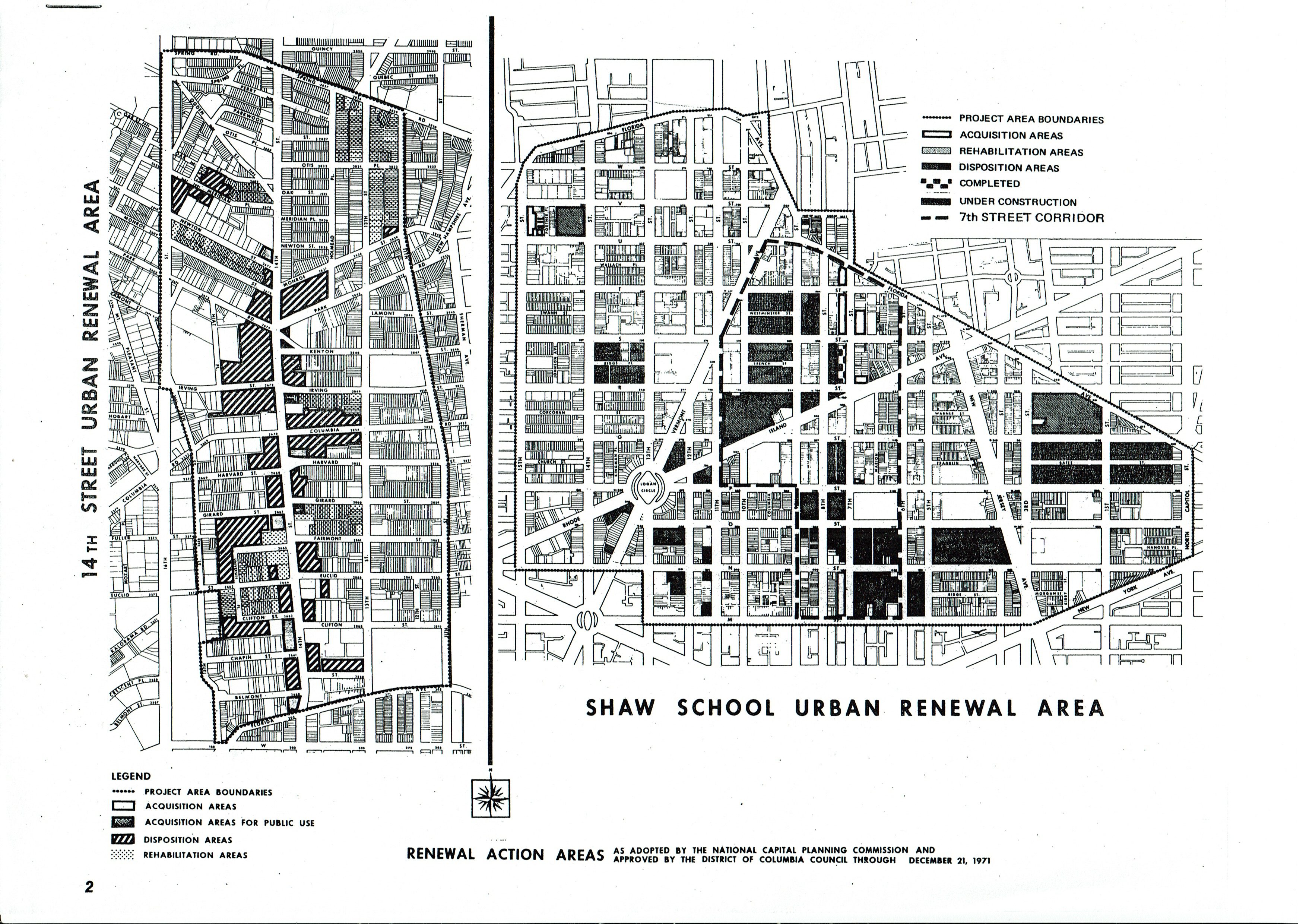
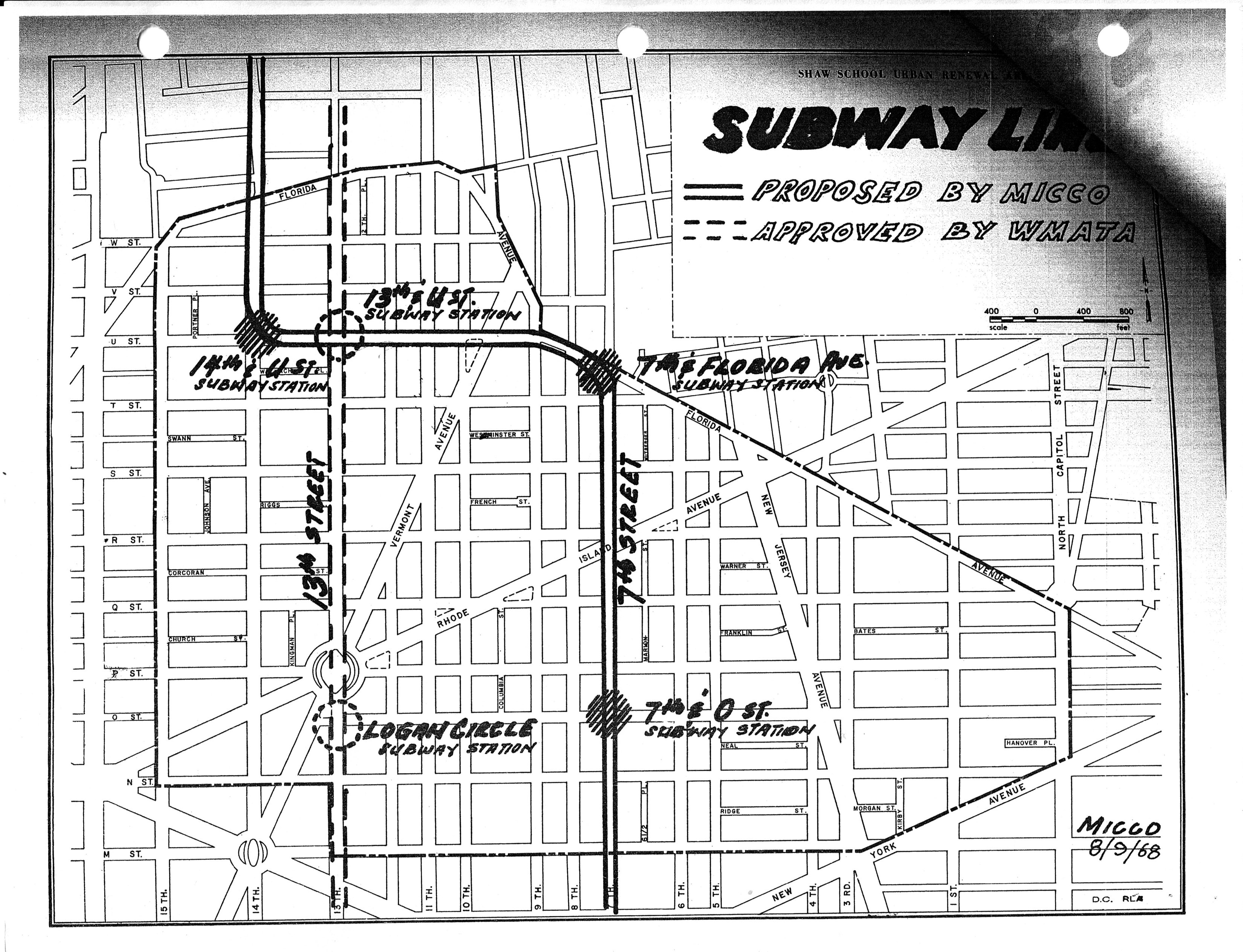
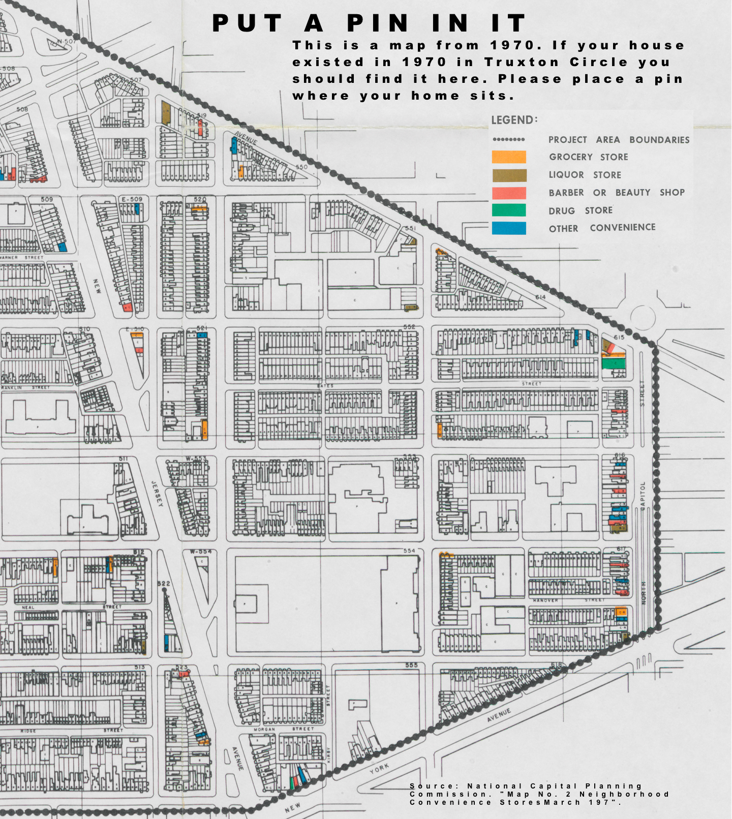
Back in 2017, I and two artist neighbors set up an exhibit at 410 GoodBuddy called The Triangle Known as Truxton Circle. I have a few things sitting on my computer from the exhibit that I’d like to share. Between no childcare and attempting to telework in less than ideal conditions, yes, I’m not posting much. But I can post this from the exhibit.
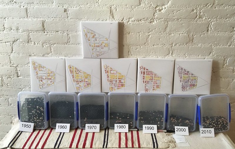
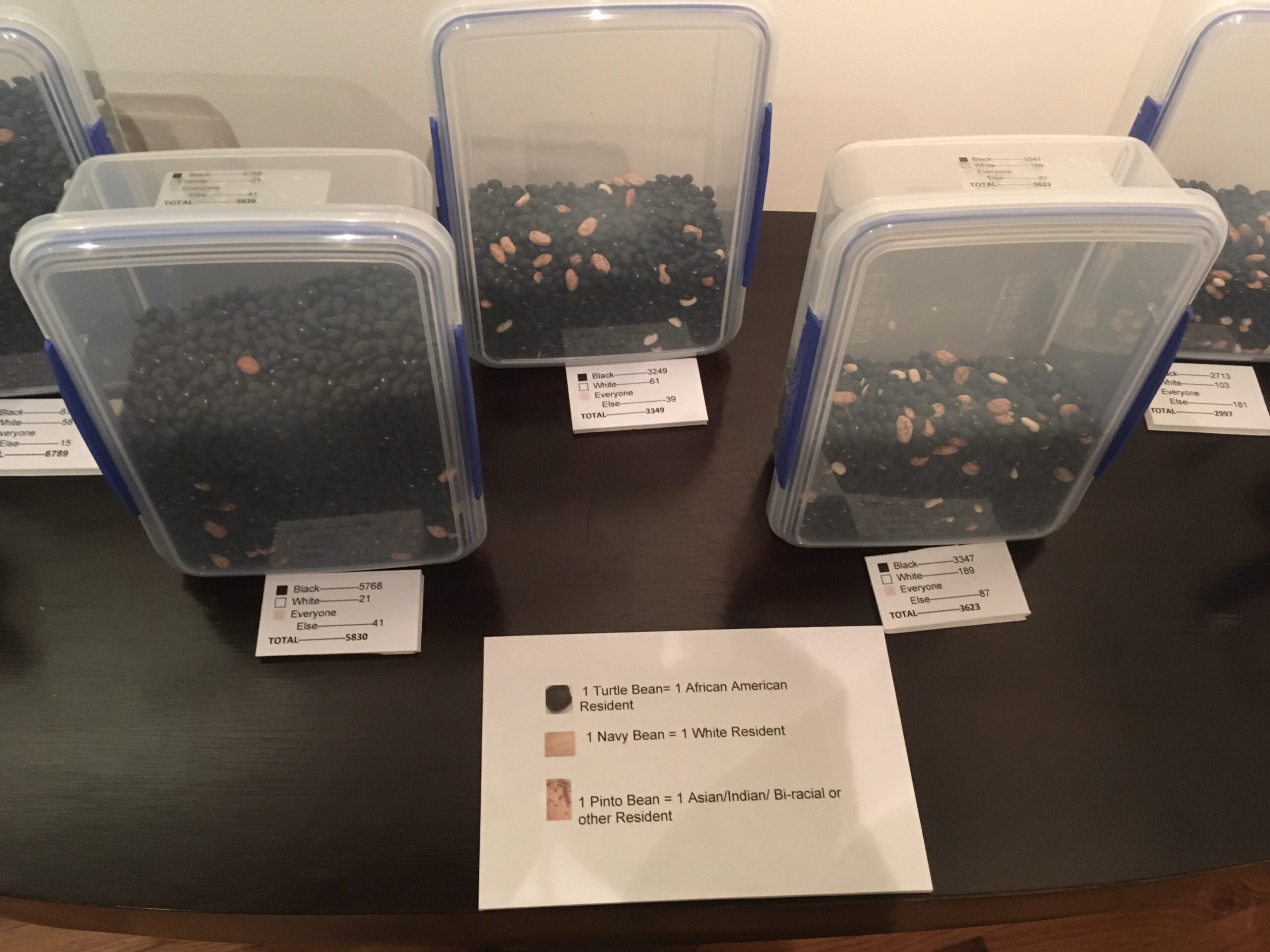
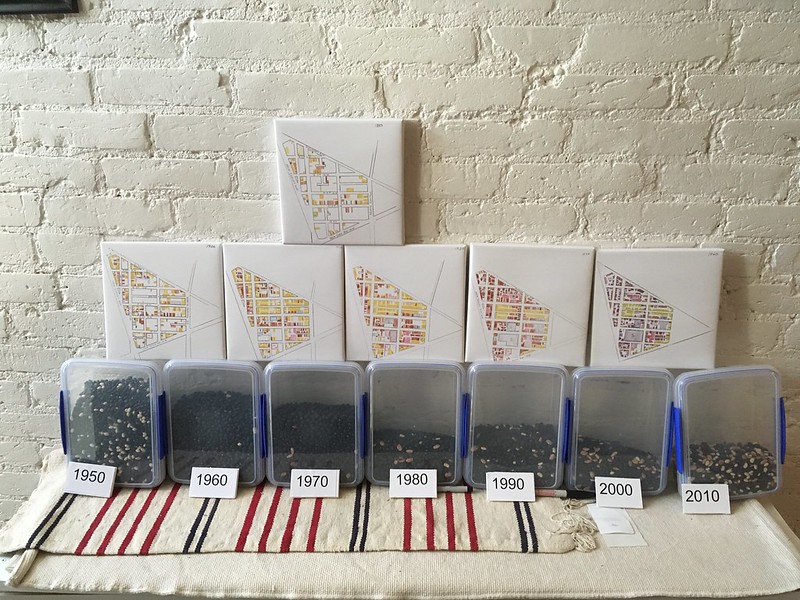
I believe this was part of Beans!, which I will get to later. I really love Beans! But you can’t appreciate Beans! until you’ve seen the maps.
Change 1880-1940
Digital print on canvas
I used US Census and city directory information to show changes in the neighborhood from 1880 (the first census with street addresses) to 1940 (the latest open census). The census is taken every 10 years.
Compare the different years, and see how the neighborhood fills in.
When does the neighborhood transform into a majority African American neighborhood?
Please go to BEANS! to see the continuation of the transformation.
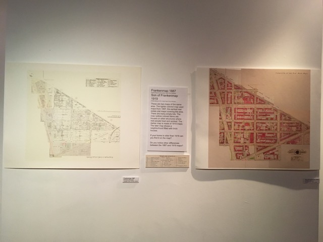
Unlike my other Triangle posts I’m going to go a bit more into the images.
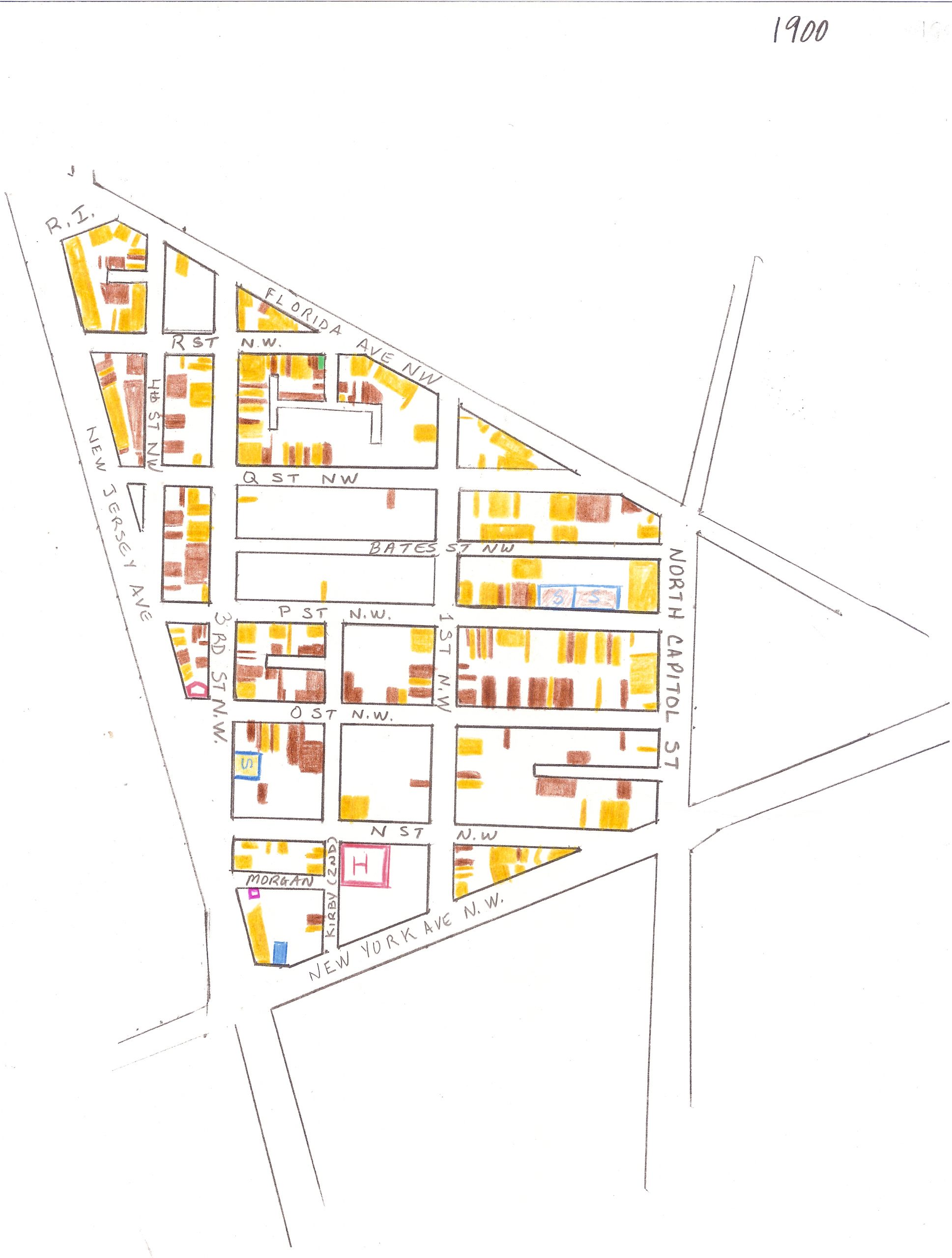
Okay the key for all these maps is:
Yellow- Whites
Brown- African Americans
Green- Asians- usually Chinese
Blue- Government facilities, if filled with brown- Black school
Purple- Commercial property

This is where black and white residents lived in the northwest part of what is now known as Truxton Circle in 1880. It is a mostly white and lightly populated neighborhood.
 So these maps are based on the US Census and the 1890 census got burned so, there is no 1890 map. So by the time 1900 rolls around as seen above there have been some big changes. There has been more development, more housing and businesses, and there is a hospital between N St and New York Avenue. Langston and Slater appear over on the unit block of P Street. So students who were not served by the white school on 3rd St, have options. The Black/White population looks kinda even, but it isn’t. The TC is still a majority white neighborhood.
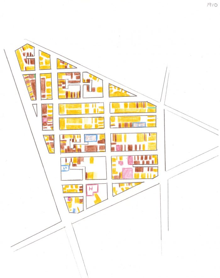
 In 1910 the neighborhood has filled many of it’s empty spaces with white households, which is still the majority.
 You can’t see it from the map but the African American population is growing. A bit crowded in the units they occupy, but growing. 1920 is the last year the non-Black population is the majority. By 1920 three more schools for African Americans appear. And then Boom.

1930!
This is where the neighborhood finally becomes the historically Black neighborhood we all know and love.
 Yes, 1940 looks different. What is brown looks purple. As you can tell this map was made at a different time. It was made quickly and specifically for the exhibit, and thus, not as good as the others. As 1940 was the last open Census available where I could say what racial group lived at what particular address, this is the last map.