 This map is of houses sold on these few blocks between 1999 and this year below $500K. There are still plenty of red stars representing sales. The blue are more than likely houses that sold prior to 1999, or the odd property selling at $500K and above. Since I did throw in the more than $500K on the map (not shown) it seems there were a few but not many. Comparing the map from Turnover part 1 to this one, a majority of the 1999-2009 sales were less than 1/2 a mil.
Yet the thing that I find really interesting is not so much the amount houses finally sell for, but the fact there are so many houses that change hands in a 10 year period. It seems to reflect the transient nature of DC or the investor fueled real estate boom of the 2000s.
Let’s say, for the most part, that the blue dots represents long timer residents and the red stars newer residents. It isn’t perfect, as the blue dots could be rentals that turn over every couple of years but never sold, and red stars rentals bought by new investors that remain rentals. On my own block one of the red stars was a rental home that the renters later bought from the owner. But anyway let’s say those red stars represent new blood on the block, in some spots, except that part of the 100 block of P, there is a fair amount of turnover.
If you get on the DC gov website and play with the DC Atlas for Real Property and compare and contrast with other parts of the city regarding final sale prices (which sometimes isn’t the listing price) and turn over, it’s interesting.
Day: November 18, 2009
Turnover part 1
I had this sitting in my draft folder. It is from November 18, 2009. Instead of deleting it I’m going to publish it, fourteen years later (6/15/2023).
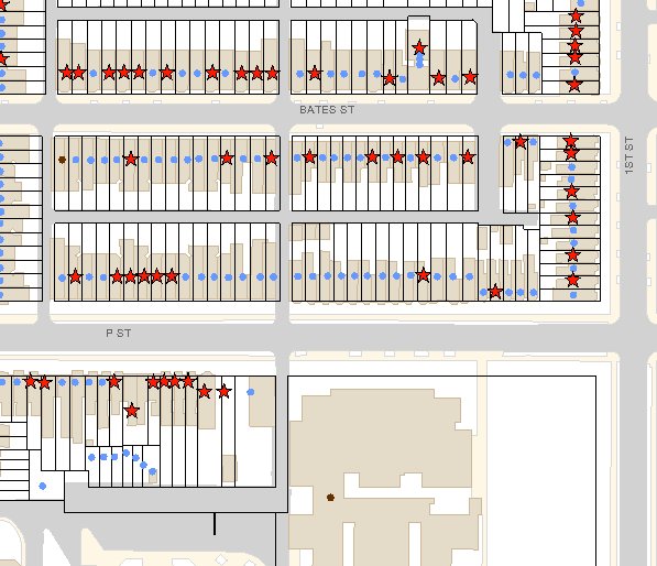
 This was stolen off of the DC government’s DC Atlas website and what it shows are houses sold between Jan 1, 1999 and yesterday (11/18/2009). More accurately it shows houses sold for more than $1 and below a billion. I had to throw that in when it showed every house with a red star and I discovered the database had some quirky dates of homes being bought by their longtime owners for 0.00, and had to find a way to exclude that misinformation.
Each red star represents a property sale, that’s it. However, one can make guesses that a majority of those sales resulted in some turn over.
Turnover part 1
This was originally posted in 2009. I am revisiting some older posts and reposting them with commentary. This is just a test run.
Re-reading this I see that I did not understand some quirks of real estate, such as when you wind up transferring a property to yourself. This happened to me when I finally got my spouse on the deed. For some odd reason I had to transfer it to myself too.
Simply said, there is turn over. There was plenty of owner turnover, or it appeared so, in the wild years of early gentrification between 1999 and 2009.
————————————————————-
This was stolen off of the DC government’s DC Atlas website and what it shows are houses sold between Jan 1, 1999 and yesterday (Nov 17, 2009). More accurately it shows houses sold for more than $1 and below a billion. I had to throw that in when it showed every house with a red star and I discovered the database had some quirky dates of homes being bought by their longtime owners for 0.00, and had to find a way to exclude that misinformation.
Each red star represents a property sale, that’s it. However, one can make guesses that a majority of those sales resulted in some turn over.