Okay maybe I’ve been unfair. So I’d like to try to be a bit more positive. Not all Suzane Reatig projects in Shaw are ugly. Since figuring out how to spell the name correctly and finding the architect firm’s site, the firm has done some lovely things in the hood. I also learned historic district- smistoric district, but more of that later.
So. The multi-unit on S Street, across from the Wonderbread, not pretty in my eyes. But you know the row of townhomes near New York Ave, on L, with the colorful doors that look so cute? Suzane Reatig! I know, I found it surprising too! The firm does a little of the same on 5th St and there is supposedly more color in the back.
 So the firm can take a townhome and spiff it up a bit.
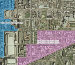
Now, historic districts. There are a few SR projects within the borders of the Mt. Vernon East Historic District, that’s the pink on the map. First thing is the Metropolitan Community Church. Being a traditionalist, my first impressions of MCC was ‘oh they’ve taken a gym and turned it into a church’. Okay, the SR site says different. Another project in the Mt Vernon East area are those lovely glass houses on N Street. I really like the back of them. The front looks very euro-something. The L Street condos previously mentioned also sit in the borders. So modernism can be in an historic district (also noticed a pretty cool Georgetown project too).
The townhomes on the corner of 5th & O look nice, in the pictures. On the ground, a little less so, but the theme of this post is positive about modernism. So there you have it, local Shaw architectural firm, some cute stuff, some not so cute stuff. Some stuff in historic districts, some stuff just sitting across the street from the HD.
5 thoughts on “Modern in Shaw”
Comments are closed.

Sorry but I’m enforcing the no anonymous comments rule today (like many days).
But to answer you. Ridge St? I haven’t walked over there in a while. I’d have to take a look.
Great post. I go by these buildings everyday, and I share your mixed feelings about them.
They seem elegantly designed, but I despise the finish materials used on the church, and the 626 S Street project. Cheap looking cement block, and really cheesy looking mauve colored metallic panels. Ugh.
Any idea why Reatig chose such cheap and ugly looking materials?
Maybe the people who hired the firm were being cheap.
Suzanne is very into inexpensive materials. most of her buildings now are constructed with prefab concrete panels (ridge st, N St..). better looking than cinderblock IMO.
Very interesting to know the link among several neighborhoods I’ve been lurking in. My contractor pal looked at the N Street glass houses (behind Ridge St NW), and noted they pretty much maxed out the proportion of land they can possibly occupy. Makes one think it’s in order to sell more sf of condos. But, MVS is a lovely area!