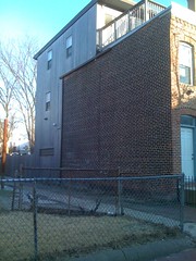
I don’t believe all pop-ups are ugly. Unfortunately there are tons of bad pop-ups that we can point to so one can get the impression that there is no such thing as a good pop-up. There is one example I like to point to of a good rooftop addition.
Over on the 1600 block of 5th Street, NW between R and Warner there is a house with a cute rustic addition. I’ve been inside once and the owners did a wonderful job with creating a new space in their home. Maybe the key in this is that it was designed and done by the people who were intending to live in the home and not a know-nothing small time developer/contractor trying to stuff a few more square feet on to a small lot. A few things makes this addition work. One is that it is on the end of a row of houses. You can get away with more on the end than you can in the middle. If the style changes up on the end of a bunch of uniform houses, it doesn’t break the pattern. Second, the addition, including the railing is set back from the street. Third, there isn’t a big empty space on the addition between the top of the roof and the top of the door/window. There is another pop-up on S Street, that’s lovely from the back but on the front there is this empty space that makes the front of the addition, ‘blah’.
I think the most important factor was that the addition was put on for the people who live in the house, and not some unknown buyer to be gouged of money.
2 thoughts on “A good Pop-up”
Comments are closed.

I remember the inside of that one – it was REALLY cool, with that cubic shower room… Kudos to them – very nicely designed and executed.
Yes, that room is brilliant. The idea of providing light and privacy by having the light from the outside cascade across the top of the bathroom cube.